At the end of the last part of our tale, Bruce and I were feeling pretty good about the state of Scheduling in SuperDuper! We’d solved the technical challenges involved, the UI for setting up the times looked good, worked well, and seemed logical.
In short, we were ready to try things out on “real users”.
In a large organization, Usability tests are done in a very formal way (you can see this in the comments for my last scheduling-related post). The user is given a series of tasks and a (typically instrumented) build, and put in a room where they can be extensively observed. Everything they do is logged, video cameras look at different aspects of the process, sometimes even physiological measurements are taken. And the team, either on the other side of a one-way mirror or in a control room away (sometimes far away) from the test, gets to watch.
What you see is always a surprise. No matter how much you plan and design and argue and rework, something
always comes up when you usability test. And it’s
never pretty.
Well, here at Shirt Pocket, we can’t afford that kind of usability test.
Instead, we select users who are good at approaching things naïvely. Each one is given the build, and a task, and then I watch and listen very carefully — often using an iSight — while they perform the task. And takes notes. And stay very, very quiet. After all, we’re hunting usability rabbits…
Well, the first tester was — of all people — my
brother Paul. Paul’s a good choice, because he’s a very typical Macintosh user, and he indicates in lots of ways, which makes his reactions easy to read.
The task in this case was pretty easy — something like “Schedule a backup of all files on your drive at a time and frequency of your choosing”.
Right off the bat, lots of confusion and the very worst question of all: “How the hell do I do that?”
And, once he found the settings in Options, and checked the box, and it didn’t seem to do anything, he thought he was done and then found out he had to manually save settings, and didn’t know why, and… well, it kept going downhill.
Not good. Not good at all.
(In a real usability test, the designers and developers at this point are usually screaming at the user — who can’t hear them — in the remote location, begging them to find the stuff they’d worked so hard on. It’s really very frustrating to have a lot of work that seemed so good fail so completely.)
So, I thanked Paul, hoping his reaction was an anomaly, and moved onto my next tester. Who reacted almost identically. And a third. Same thing.
The fourth, a user who had previously used saved settings extensively, had virtually no problem at all.
75% failure. Many, many points of confusion. Most of the nice touches in the UI — and there were many — were ignored because the major portion of it was fundamentally flawed: it assumed you knew about saved settings and were comfortable with them, and the
vast majority of users know nothing about saved settings and don’t
want to know anything about them.
An unmitigated disaster. I’d
really screwed the pooch. Gah. And now I had to tell Bruce how poorly it went, and fix it…
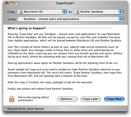
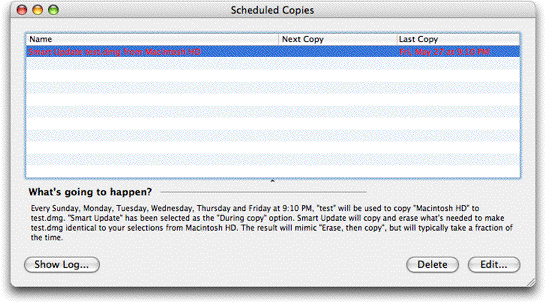 (In what you’re looking at, the red entry has failed to run: clicking Show Log will give the reason why.)
Of course, there are many parts here you can’t see: the way the “Scheduled Copies” window comes up and moves forward when it’s time to schedule, emphasizing the second type of use; the sheet that actually gives you the way to select the repeating timeframe; the new log window that makes it easier to contact support; schedule editing. But you get the general idea: it’s quite simple.
The second test commenced with the same four users, and it went great. Every one completed their task with no confusion, save for one point: most didn’t unlock the application, so the schedules never ran. Once we took care of that: bingo.
We’ve got scheduling!
(In what you’re looking at, the red entry has failed to run: clicking Show Log will give the reason why.)
Of course, there are many parts here you can’t see: the way the “Scheduled Copies” window comes up and moves forward when it’s time to schedule, emphasizing the second type of use; the sheet that actually gives you the way to select the repeating timeframe; the new log window that makes it easier to contact support; schedule editing. But you get the general idea: it’s quite simple.
The second test commenced with the same four users, and it went great. Every one completed their task with no confusion, save for one point: most didn’t unlock the application, so the schedules never ran. Once we took care of that: bingo.
We’ve got scheduling!